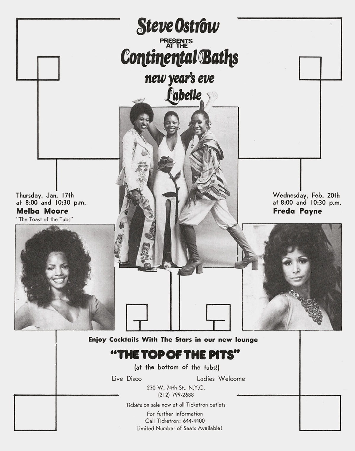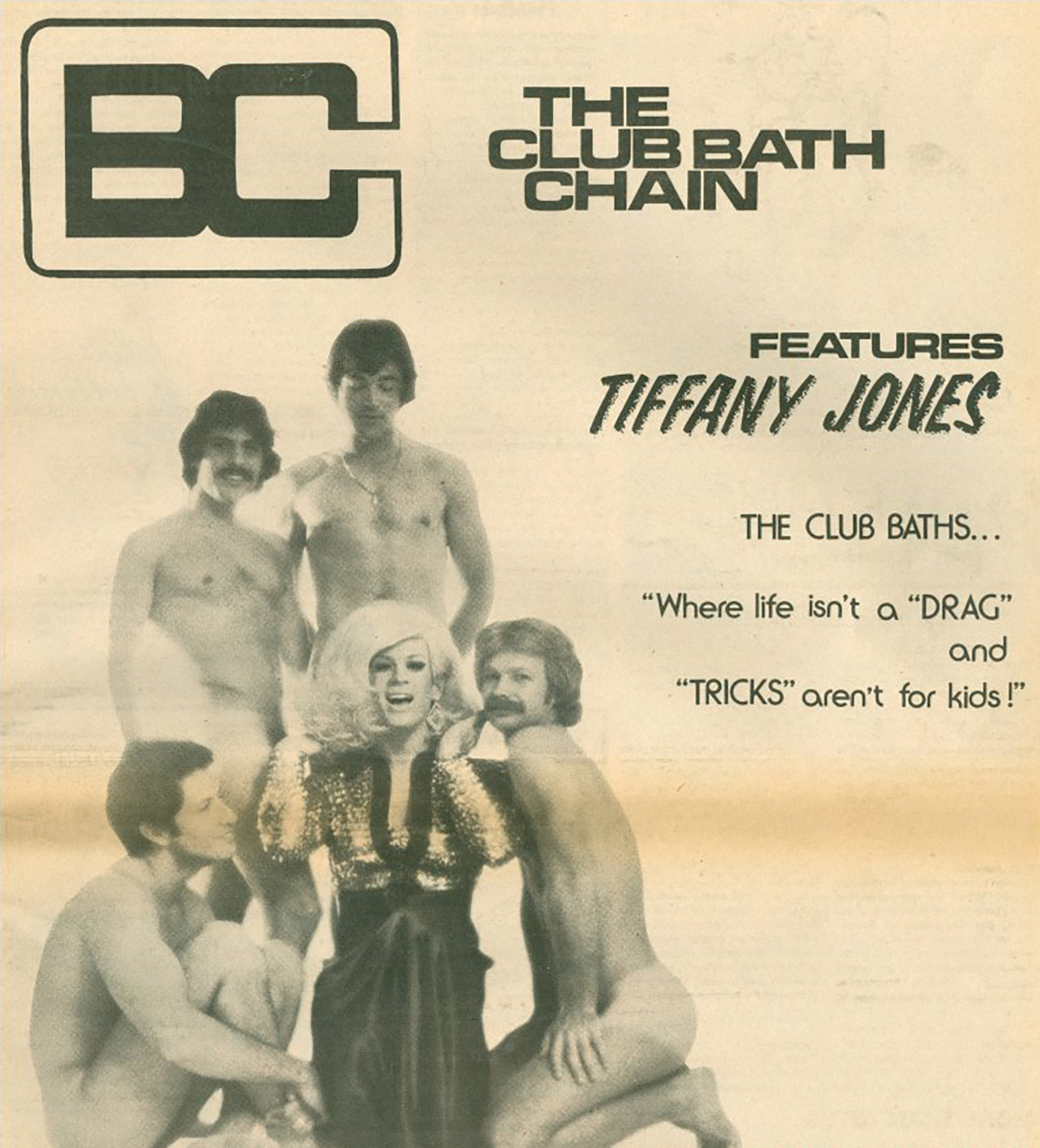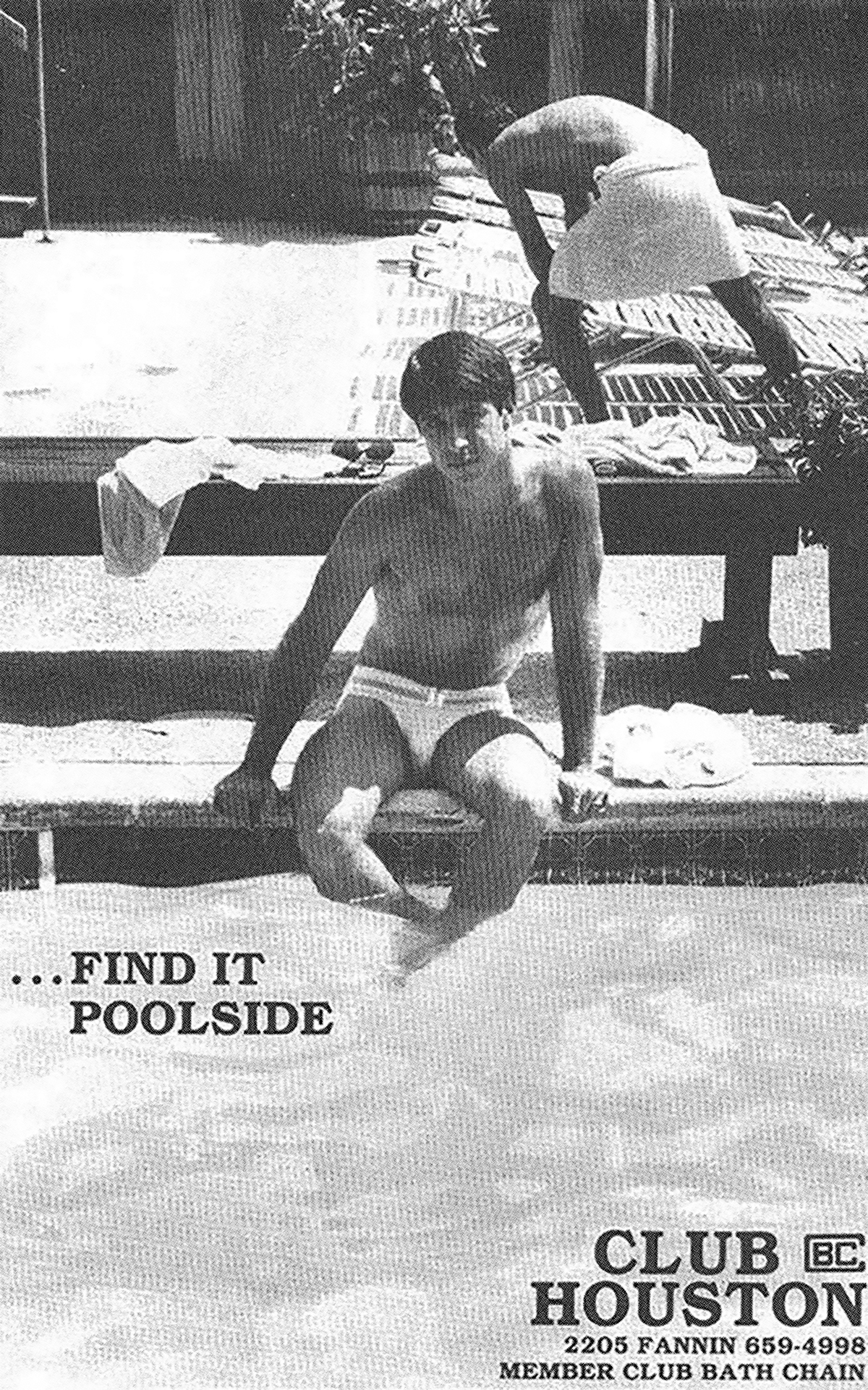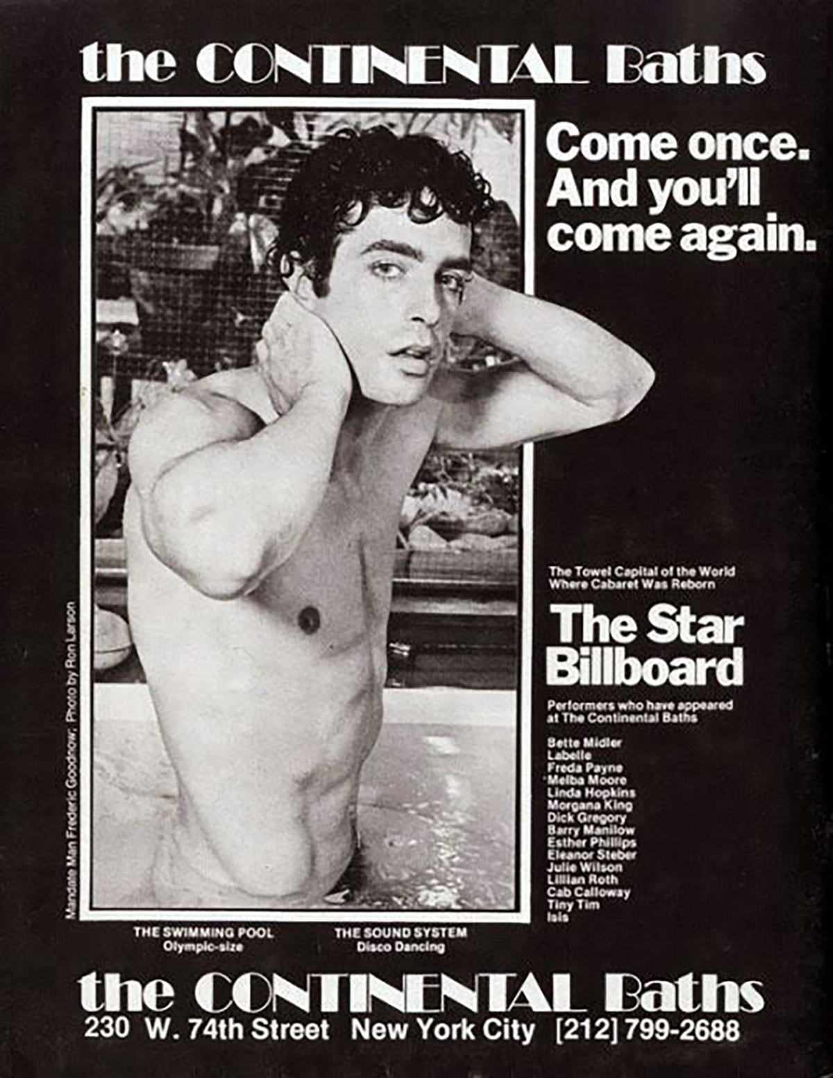

Bathhouses popped up in cities in the late 50s and offered a safe haven—at least temporarily, before becoming subject to police raids—for gay sex and community. In addition to being a grounds for cruising, bath houses were a place of entertainment. The renowned Continental Baths in New York even gave rise to broadway star Bette Middler, who would often perform there in the early 1970s.
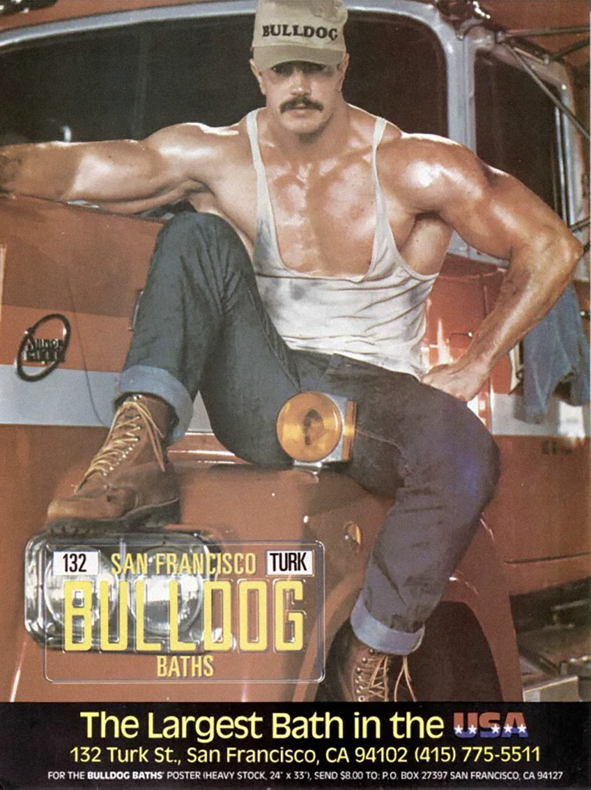
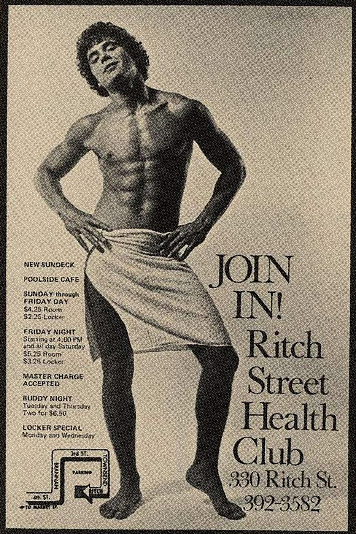
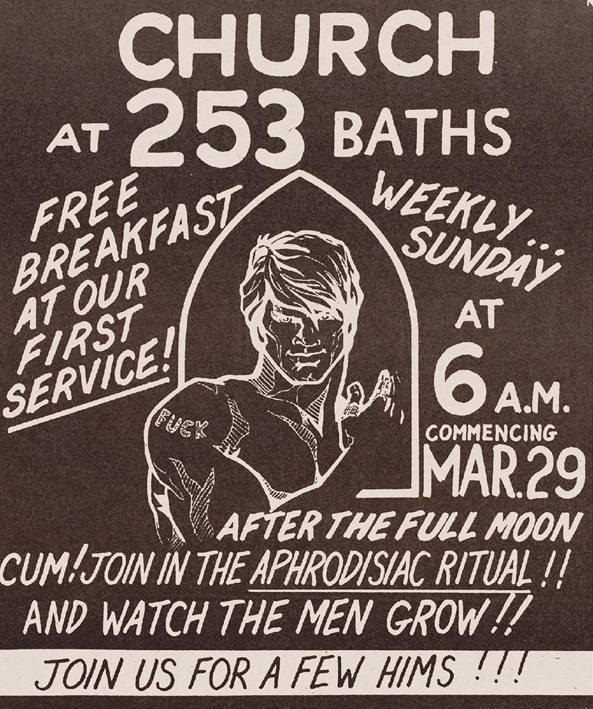
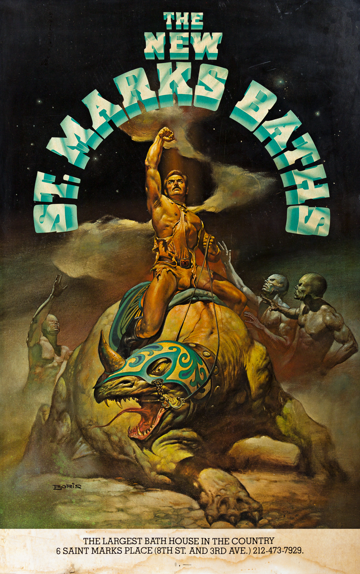
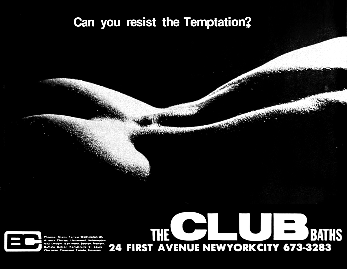
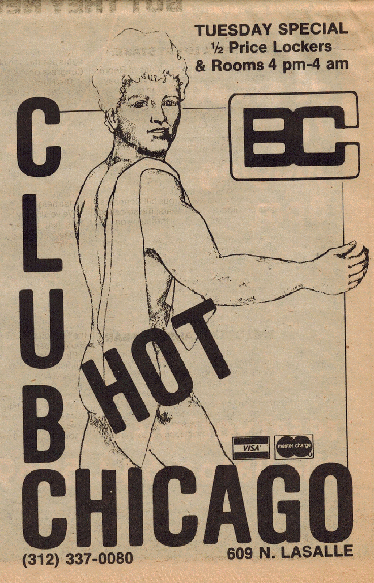
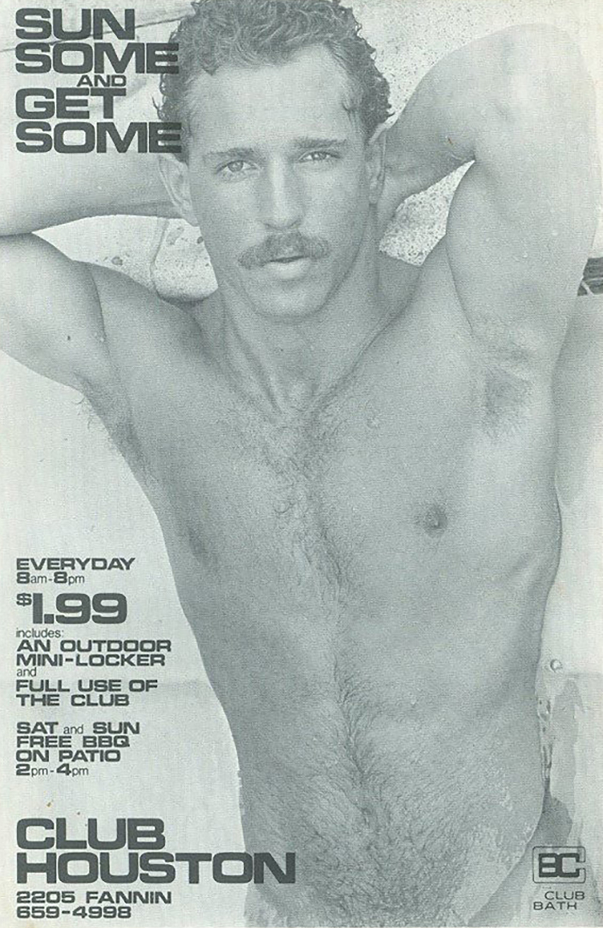
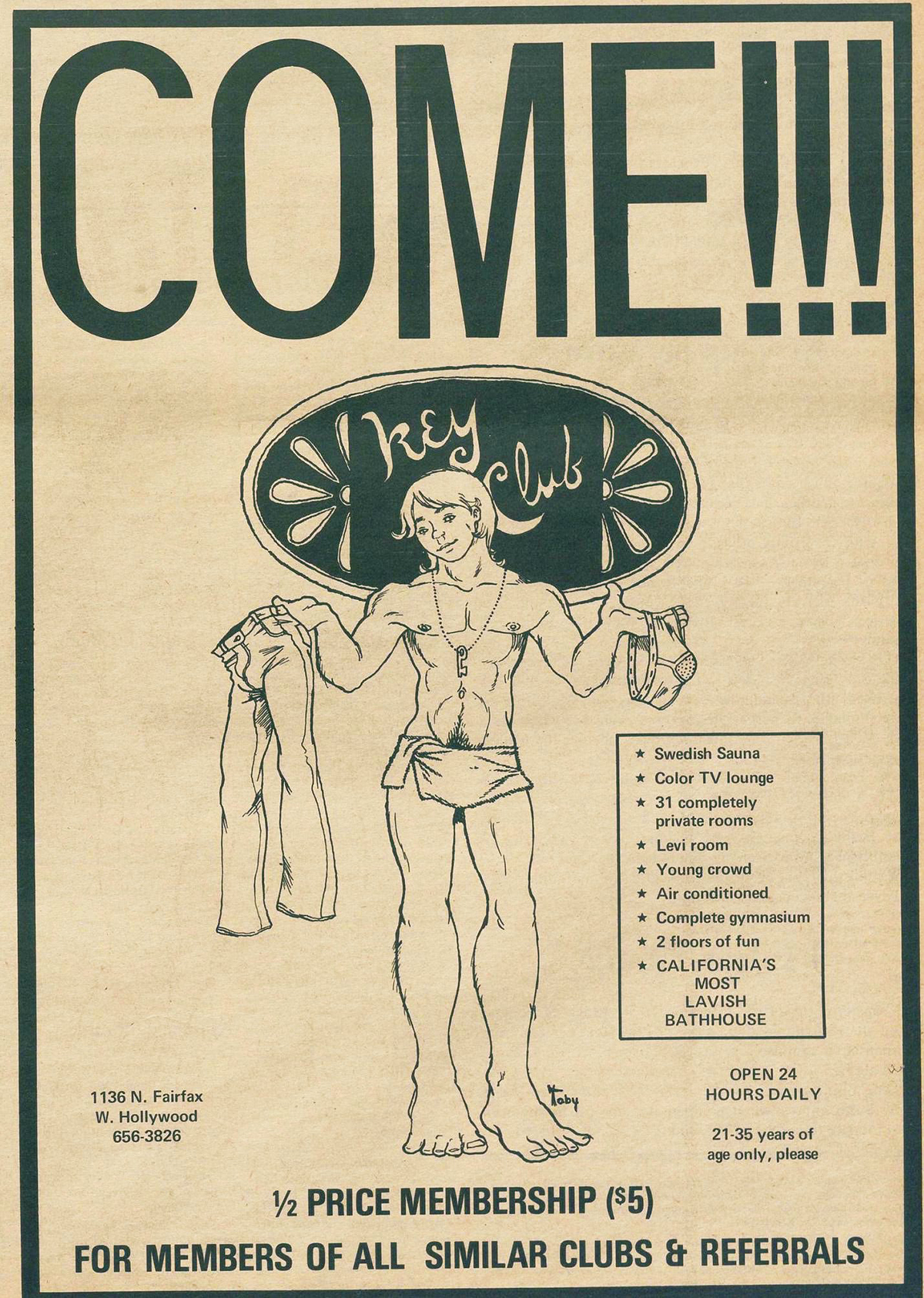
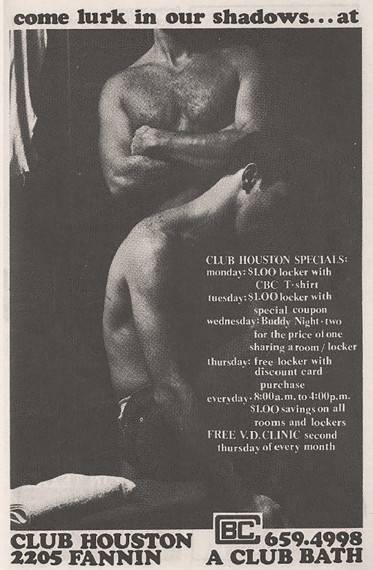
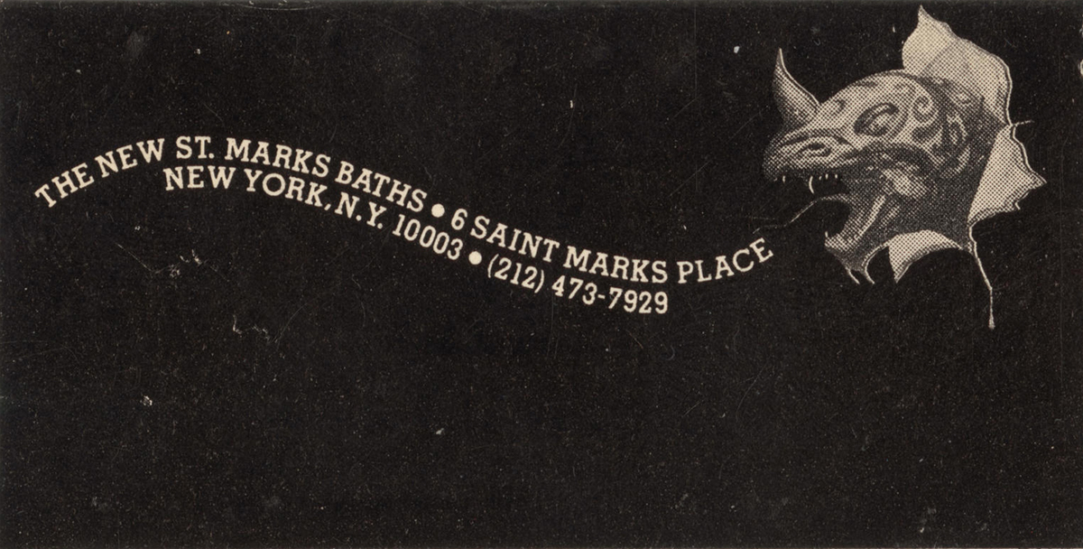
The bathhouse posters themselves often included black and white photography and illustrations depicting idealistic nude men enjoying each other's company—or seducing the viewer. The posters were overtly sexual and unapologetic. Though the designers of these posters are largely unknown, they would sometimes borrow imagery; a poster for St. Marks Baths co-opted an illustration, Mysterious Rider (1978) by Boris Vallejo for an advertisement.
The posters were riddled with pleasure and excitement. The provocative imagery offered an innate rebellion, demonstrating that “sex sells” long before this idea made its way into mainstream advertising. However these posters did more than sell: they fostered community in a time when it was needed most.